Improspekcije 2013
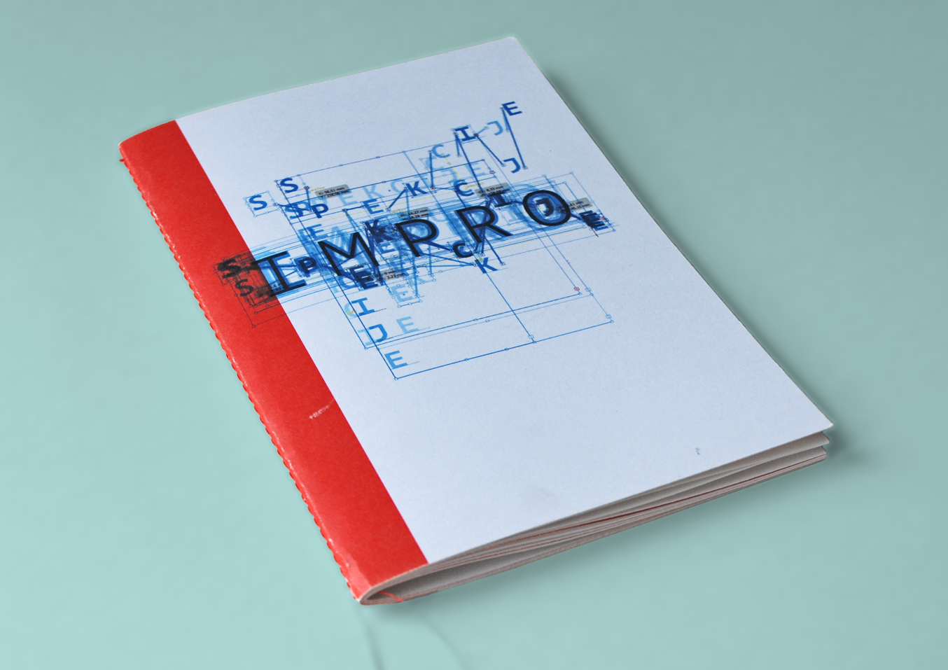
The visual identity of the festival of improvisation in applied arts — Improspekcije is based on the use of similar techniques of improvisation but in design. Improvisation in design is often invisible and hardly clear because it lacks the time component. Led by this disadvantage we noted down the designing process of the logo through automated screenshooting every 10 seconds. At the end we merged all the photos into one and got the final image.
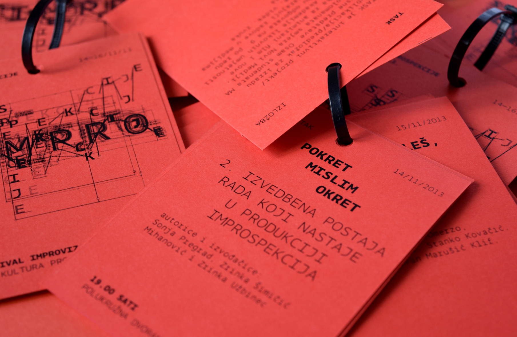
We also did flyers which, with its black plastic string passes on the soul of the makeshift DIY aesthetic and the brochure layout without undoings and erasing.
We also did flyers which, with its black plastic string passes on the soul of the makeshift DIY aesthetic and the brochure layout without undoings and erasing.


Co-authors Dora Đurkesac, Zoran Đukić Client Improspekcije 2013